In the diverse world of fonts, there exists a category that commands attention with its bold, distinctive, and robust appearance: Slab Serif fonts. These fonts have a unique character that sets them apart from the crowd and makes them ideal for various design contexts. In this exploration, we’ll delve into the intriguing realm of slab serif fonts and unveil the reasons behind their enduring popularity.
Table of Contents
The Anatomy of Slab Serif Fonts:
Before we dive deeper into the world of slab serif fonts, let’s dissect their anatomy:
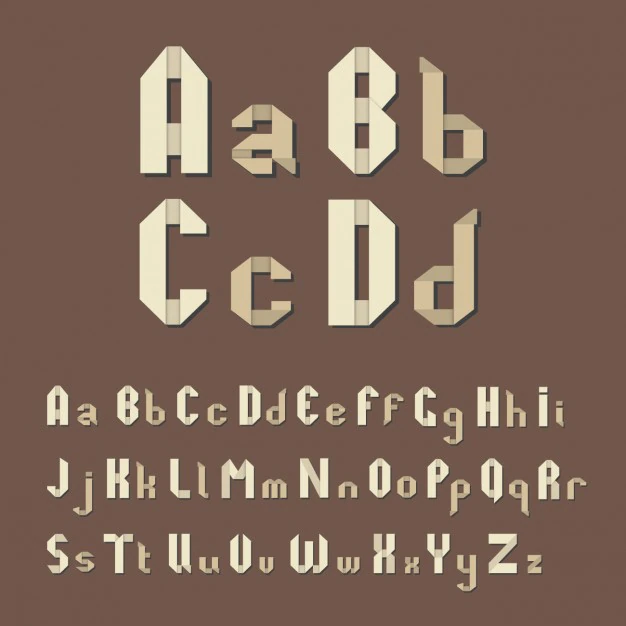
- Slab Strokes:Slab serif fonts are known for their prominent, block-like serifs that project a sense of stability and confidence. These serifs are unbracketed, meaning they form a direct connection with the letter’s stems.
- Even Stroke Width: Unlike the varying stroke thickness found in some fonts, slab serifs maintain consistent stroke width throughout. This uniformity contributes to their distinctive appearance.
The Characteristics of Slab Serif Fonts:
What makes slab serif fonts stand out in the typography landscape? Several characteristics define their appeal:
- Bold and Eye-Catching: The most noticeable trait of slab serif fonts is their boldness. They demand attention and are often chosen when a design requires a strong, confident statement.
- Readability: Despite their boldness, slab serif fonts remain highly readable, making them a practical choice for headlines, subheadings, and even body text in some cases.
- Versatility: Slab serif fonts have a broad range of applications, from editorial designs to branding and logo development. They possess a unique charm that can be adapted to various design needs.
- Nostalgic and Timeless: Slab serifs are associated with a certain vintage or retro vibe. This nostalgia factor makes them particularly popular in designs aiming to evoke a sense of history or timelessness.
Subcategories of Slab Serif Fonts:
Within the world of slab serifs, we find various subcategories, each with its own distinct features:
- Clarendon Slab Serif: The Clarendon typeface is one of the earliest slab serifs, known for its antique, vintage character.
- Geometric Slab Serif: These fonts emphasize the geometric shapes of letters and serifs, offering a more modern appearance.
- Typewriter Slab Serif: As the name suggests, these fonts resemble the characters produced by typewriters. They have a monospaced quality with equal character widths.
Applications of Slab Serif Fonts:
- Logos: Many iconic brands, including Sony and Jeep, use slab serif fonts in their logos to convey a sense of reliability and heritage.
- Posters: When you want to create a poster that screams for attention, slab serifs are your allies.
- Newspapers and Magazines: In editorial design, slab serif fonts are often used for headlines and subheadings, adding a touch of authority to the content.
Conclusion:
Slab serif fonts have an undeniable presence and impact in the world of typography. They’re the bold storytellers, the attention-grabbers, and the vintage throwbacks all at once. Their timeless appeal and adaptability make them a valuable asset in a designer’s toolbox. So, whether you’re reviving a touch of nostalgia, aiming to create an eye-catching headline, or crafting a logo that exudes strength and reliability, consider the robust elegance of slab serif fonts.